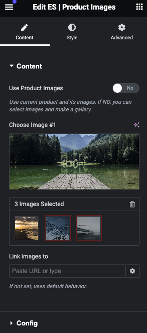
Content Section

- Use Product Images: By default, this is set to ‘Yes’, utilizing the product’s images where the featured image becomes the primary image. Selecting ‘No’ enables you to customize the images:
- Choose Image #1: Here, you can select the featured image for your product.
- Select Additional Images: Add more images to your gallery for a comprehensive showcase.
- Link Images To: Assign a destination URL for all images, directing to a product, category, or page.
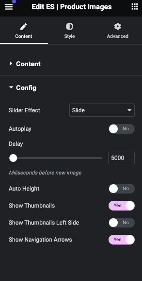
Config Section

Customize how your product images behave and appear to your visitors:
- Slider Effect: Choose the transition effect between images. Options include Slide, Flow, Cube, and Coverflow.
- Autoplay: Enable to have images automatically transition.
- Delay: Set the time between transitions. Default is 5000ms.
- Auto Height: Allows the main image to adjust its height automatically.
- Show Thumbnails: Displays thumbnail images below the main image by default.
- Show Thumbnails Left Side: Position thumbnails to the left of the main image. Displays 4 thumbnails, with more revealed upon navigation. Note: This is available only if ‘Show Thumbnails’ is enabled.
- Show Navigation Arrows: Recommended to enable for easy image navigation. Without thumbnails or navigation arrows, pagination dots are displayed by default.


