The content – Toggle has the following options:
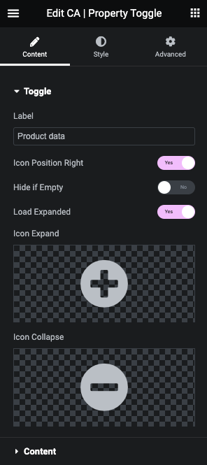
- Label: set the label (e.g. a group name like: Measurements) for the content you want to toggle
- Icon position right: if YES you set the icons to the right side of the label (in style you can decide width and more for this), if NO you get the icon left of the label
- Hide if empty: if YES the toggle control hides itself if the content has no values
- Load expanded: if YES the toggle shows the content on load, if NO you need to click the label / icon to expand content
- Icons:
- Select icon to use on expanded content
- Select icon to use on collapsed content
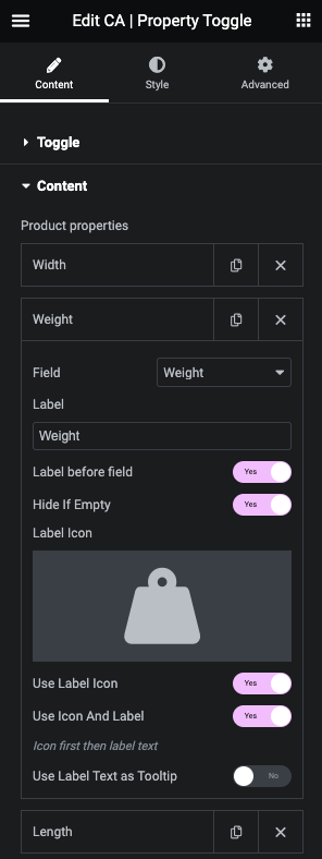
Product properties / fields gives you the option to add as many product properties as you like. The properties is the same as used in the Product fields widget and has the options:
- Field: select a field / product property you like to show.
- Specials:
- Custom field: will add an extra input where you need to enter the custom product field (that you have created on your products)
- Stock status: will list stock statuses you have (even custom statuses) and you can here set your own labels for them.
- Specials:
- Label: set the label you want for the property (e.g. Weight)
- Label before field: if YES you will have e.g. Weight 2.4kg, if NO you get: 2.4kg Weight (Note: style this in the style section)
- Hide if empty: if YES the label and “value” will be hidden if the property has no value
- Label Icon – select a label icon to use before (or instead of) the label
- Use label icon – Yes to use it
- Use Icon and label – Yes to use both
- Use Label Text as Tooltip – Yes to use the label text as a tooltip for the icon
