Style the toggle (only heading) with this options:
- Font color: set the font color for the label
- Font color hover: the the font color for the label on mouse hover
- Typography: set font, font size and more for the label
- Icon color: set the toggle icon color
- Icon color hover: set the toggle icon color on mouse hover
- Icon size: set the size for the toggle icon
- Background color: set the background color for the toggle heading
- Background color hover: set the background color for the toggle heading on mouse hover
- Container with: set the total width for the toggle heading
- Label width: set the width for the label (e.g. Measurements), the rest will be for the toggle icon
- Padding: set the padding (inner space) for the toggle heading
- Margin: set the margin (outer space) for the toggle heading
- Border radius: if you like rounded corners for the toggle heading – set the values here
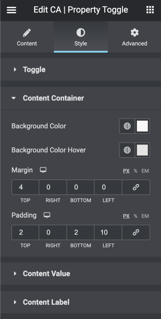
Content container (listed properties) options:
- Background color: set the background color for the property list
- Background color hover: set the background color for the property list on mouse hover
- Margin: set the margin (outer space) for every property line
- Padding: set the padding (inner space) for every property line
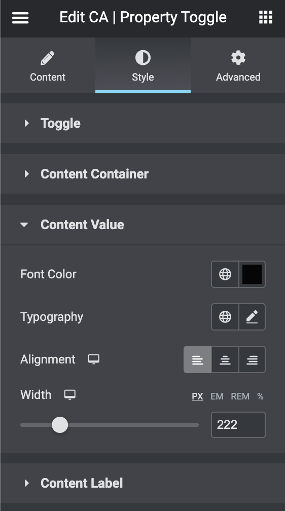
Content value (listed properties) options:
- Font color: set the font color for the properties
- Typography: set font, font size and more for the properties
- Alignment: align the properties as you like
- Width: set the width for the properties
NOTE: this is for the properties values
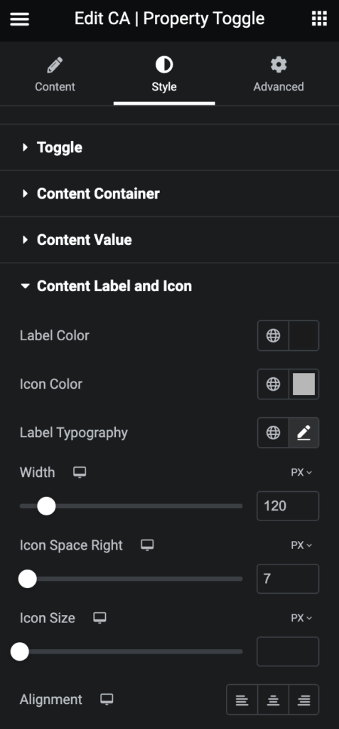
Content Label and Icon:
- Label Color: set the font color for the properties
- Icon Color: set the color for the icon
- Label Typography: set font, font size and more for the properties
- Width: set the width for the properties
- Icon Space Right: set the space (margin) right
- Icon Size: set the size for the icons
- Alignment: align the label and icons


